|
 |
Okay, so I've finally gotten all the details to a level where I'm satisfied
with it. (You wouldn't believe how many tweaks I've made since the last
version I posted, that probably no one else than me even notices...) Making
test-prints with my printer have made me aware of issues with things than
don't work as well on print as on the screen, because nuances in colors and
luminance is lost once printed. To deal with that, contrast of certain
textures have been enhanced, which looks better on the screen too as a
bonus.
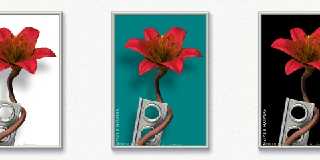
Anyway, I've splitted the image into several layers, and once the background
layer was separate, it suddenly got temptingly easy to play around with
it... In my head the background was always just white, but after having seen
some of the possible alternatives, I'm suddenly not sure I prefer white
anymore. I don't know which version I want to have printed!
What to do, what to do...
What do you think?
Teaser image is attached, the full versions can be seen here (in png format,
so the page is slightly heavy):
http://runevision.com/3d/metalandflowers/
BTW, the blue, teal and green color is carefully selected. Colors with red
in don't work well so shades of red, yellow, and violet are out. Also, light
colors don't work well (except completely white), nor almost black or gray
ones (except completely black). I also tried some linear gradient with color
to white and color to black. At first it looks really sweet, but after
looking at it for a little white it begins to just look cheap. Compromises
don't work here. Just one strong color.
Rune
--
http://runevision.com
Post a reply to this message
Attachments:
Download 'metal12_color_strip.jpg' (76 KB)
Preview of image 'metal12_color_strip.jpg'

|
 |


![]()